Final Piece

Final Piece

About the Blog

This blog is a representation of my working progress as an Artist and Writing. Everything here is an example of my work and a journey through my working. It acts as a documentation of various projects, ideas and rough experiments, starting from my time at University and beyond.

25/02/2014

Thinking About My Practice | Poster Brief | InDesign Workshop / Content

Not knowing much about InDesign and having not used it before I was a little worried about my poster brief, which states that it has to be created on this software. However after a days session on InDesign I found it was a lot easier than it looks, also it will benefit my work greatly, especially in organizing text for digital print, even more so as a text print or book form.

My first steps in creating the twitter feed template involved taking a screenshot of my own twitter feed in order to use this as a base. This made the whole process even easier as my next steps were to simply create boxes mimicking that of what was present underneath.

By doing so it started to look like this...


By doing this also I was able to layout the text in a similar way, making it look realistic and also allowing me to add my own touches to it that I wouldn't have been able to do so on my own twitter page. 

From left down to right up of content position:

Top Bar - Stays the same 

Left Box 1 - The same, with 'Tweets' in bold to represent what page it would currently be on. 

Left Box 2 - Still labelled 'Photos and Videos,' however I have added in images of my last few pieces of work and my own images that represent my current practice. 

Left Box 3 - Still labelled as 'Who to follow,' of which I have changed the images and text to artists and books/magazines I have recently been recommended to research. 

Left Box 4 - Still labelled as 'Trends,' however I have changed the original hashtag trends to a list of words associated with my practice all put in hashtag form e.g. #Dada, #Font #Typewriter.... 

Left Box 5 - The copyright text has been replaced with links to my blog, website and also my email, twitter and instagram accounts. 

Right Box 6 - Still labelled as 'Tweets,' but instead of adding my current list of them, I have created a series of tweets from a series of artists, writers and myself that illustrate theory, content and ideas behind my work.

Right Box 7 - Still set out as profile page, but rather than a few 'about' words I have added my artist statement to this which is a short paragraph that underlines the key components of what I do. 

The poster is starting to come along at this point as well as my presentation which will go alongside this. 
Exhibition Consideration | Overheard Conversation Collection | Paper

I have started to take consideration of my presentation of these sentences further, thinking about paper to use. Before I used a cream A5 letter paper, the size worked well with the size of the text from the typewriter so this is to remain the same. However I am limited to the cream paper now as the stock has been discontinued, however the cream may not have been the right paper for it in the first place.


I tested out using a blue graph paper and a thinner white paper all of the same size. The idea was the have three versions of each sentence, in order to create a series of paper that reflects on the idea of slowly loosing sentences. But this all became too complicated and if they were to be handed out to different people the connection wouldn't work.

So between the three, the blue graph was too busy, messy and took the attention away from the sentences. The cream I am limited on, meaning that only a small collection would be made, but also it was quite thick and maybe too nice of a paper for this throwaway comment idea. The last is the thin white paper, which does seem quite throwaway and temporary. Also I am able to get my hands on a large quantity of this type, which takes away that limit. I need to make enough to match the amount of handouts and there needs to be enough of these for the amount of visitors that are likely to take one. We estimated around 150 handouts would be enough, taking into consideration those who wouldn't be taking one as well.

24/02/2014

Exhibition Invite | Open Closet at Lamberts Yard | Leeds College of Art Level 5 End of Year Show

In a couple of months our course nears the end of the Second Year. Of which are all set and ready for our exhibition which is opening on Thursday 6th March and running over that weekend at Lamberts Yard. You are all invited to the Opening Night of this Leeds College of Art Fine Art exhibition to see a range of contemporary works from just over 40 artists. 

Link to Facebook event


23/02/2014

Published Writing | Film | The Lego Movie – This film is for you, whatever your age (For Leeds Student News)

My review of the Lego Movie written for Leeds Student News, printed in the 21/02/2014 issue of LSi. The original can be found here.


Image: Warner Bros.
No words can fully describe how excited I was for this film. Not only is it a Lego movie, it was created by the same guys who made Cloudy with a Chance of Meatballs. By taking an ordinary minifigure called Emmet and making him extraordinary, the Lego Movie formed something you don’t quite expect from a childrens movie. This film very much sits with the style of Wreck it Ralph in that it appeals to a young audience in its form and colour, and it appeals to older audiences through thoughtful ideas, dialogue and memories of the past.
There’s much more to this movie than just lots of colourful bricks. It centres around solid morals and a story questioning a whole range of issues. On the surface it’s extra fun and entertaining, as the master builders attempt to save the day from President Business destroying the Lego city. Where else could you find Batman, Superman, Abraham Lincoln and Gandalf all in one movie?
You are transported to the Lego universe as you follow a huge cast of actors playing very diverse characters. I enjoyed the character of ‘Benny the 80s Something Space Guy’ and I wasn’t alone. One child insisted on quoting this character even after his parents told him off. This film managed to keep up a love of Lego for fans of all ages as well as keeping the storyline a surprise. It all boiled down to a thoughtful and interesting ending that I didn’t expect. No matter what your age, don’t be embarrassed to go and see this film; it isn’t just made for fans of the franchise, but also for those who just want a laugh.

18/02/2014

Published Writing | BAFTA Roundup | 12 Years A Slave wins Best Picture (For Leeds Student News Online)

My 2014 BAFTA overview written for Leeds Student News, as an online special. The original can be found here.

Last Sunday was time again to celebrate not only the past year in film, but also the people who made it happen and those among them we lost this year. The BAFTAs 2014 saw Gravity, 12 Years a Slave and American Hustle emerge as the big winners of the night.
I did something I don’t normally do when I view awards ceremonies, and that is watch the red carpet coverage. Honestly, you’re never missing much that the awards themselves don’t cover in the terms of dresses and general chit chat; however one thing that isn’t present inside the Royal Opera House is the deafening screams of star struck fans in their desperation to get an autograph. So much so that Oprah Winfrey said of her first time at the BAFTAs “I thought it would be very British and Subdued.. NO!” At least the weather held up, which is often the most unpredictably British part of the awards, and thankfully for the A-listers and their hairdos, it didn’t rain this year.
Film awards can be very hit and miss. It not only depends the films, the stars, but also the most important point of all, the host. National treasure Stephen Fry is always an utter delight and last year he hosted the BAFTAs with characteristic wisdom and wit. This year however saw a more nervous, more subdued Fry. His jokes kept a level of slight playfulness, but stayed safe enough not to upset anyone, including the opening line “I find myself humbled, honoured and – in the best sense of the word – paid to be here.” Fry continued the joyous jokes by asking Leonardo Dicaprio to continue a BAFTA tradition and blow a kiss to the camera in his explanation that “we drew lots until your name came out, what are the odds of that?”
Onwards with the night, and we saw a film and music montage from Tinie Tempah and Laura Mvula with clips from the past year of films which reminded me of some fantastic films overlooked in the nominations. The performance was a little odd, and the response from the crowd seemed to reflect that; news of Tinnie’s high five with Prince William erupted on twitter not long after. Fry jumped in just before the announcements to address what can be one of the most painful elements of these ceremonies, in the most British way possible, by saying that when you say thank you after receiving a cup of tea “you don’t thank the kettle, the cup, the milk, the cow, the tea picker.”
The night saw Alfonso Cuaron’s space thriller Gravity bag several awards, including Best Director and Outstanding British Film, which makes one wonder what actually constitutes a British production: is it just based on where the thing is filmed? Gravity also went on to win Best Sound, an award accepted with a cheeky “there is no sound in space, but there you go.” Universally acclaimed 12 Years a Slave was another close contender, winning both Best Picture and Best Actor for Chiwetel Ejiofor. However, the award I was most interested in was The EE Rising Star Award, partially voted for by the public. Dane DeHaan, George MacKay, Lupita Nyong’o and Léa Seydoux were all fantastic nominations, but the award was deservingly won by Will Poulter of Son of Rambow and We’re the Millers fame, who gave a very heartfelt speech. A few other inspiring acceptance speeches that should be noted include Cate Blanchett’s after picking up her award for Leading Actress in Blue Jasmine. In a gracious and touching manner, she dedicated her award to the late Philip Seymour Hoffman. Last but not least came Dame Helen Mirren who picked up this year’s Fellowship award and gave a thoughtful speech about remembering those who inspired you and, in doing so, thanking them.
Through award ceremonies we remember the films of that year, give praise to exceptional films and remember those in the industry whom the world has lost. It is a celebration of all things film and those who are a part of it as both makers and viewers, something that will hopefully go on to inspire future film makers.

17/02/2014

Thinking About My Practice | Poster Brief | Layout ideas

For my academic poster the first thing I needed to think about is the layout of my poster, the best thing to do being to take a already existing layout of which I can either add to or recreate on InDesign. The template needs to be something that reflects my practice, especially as it will be the center of my poster.

I decided either something to do with text, text placement or social networks. Below are some of the ideas I have considered...

A book layout

Using a book layout would allow me to not only layout text, but as seen below, if positioned properly I can form it using images, text, diagrams and so on making it a multi function. However it would need structuring more as a spread of two pages may become a little overpowered with content and loose what I am trying to show.


If I was to use this layout, I would create it as seen bellow as an open book in the center of the poster, allowing people to see that it is a book to draw the connection between text and where is may be found.


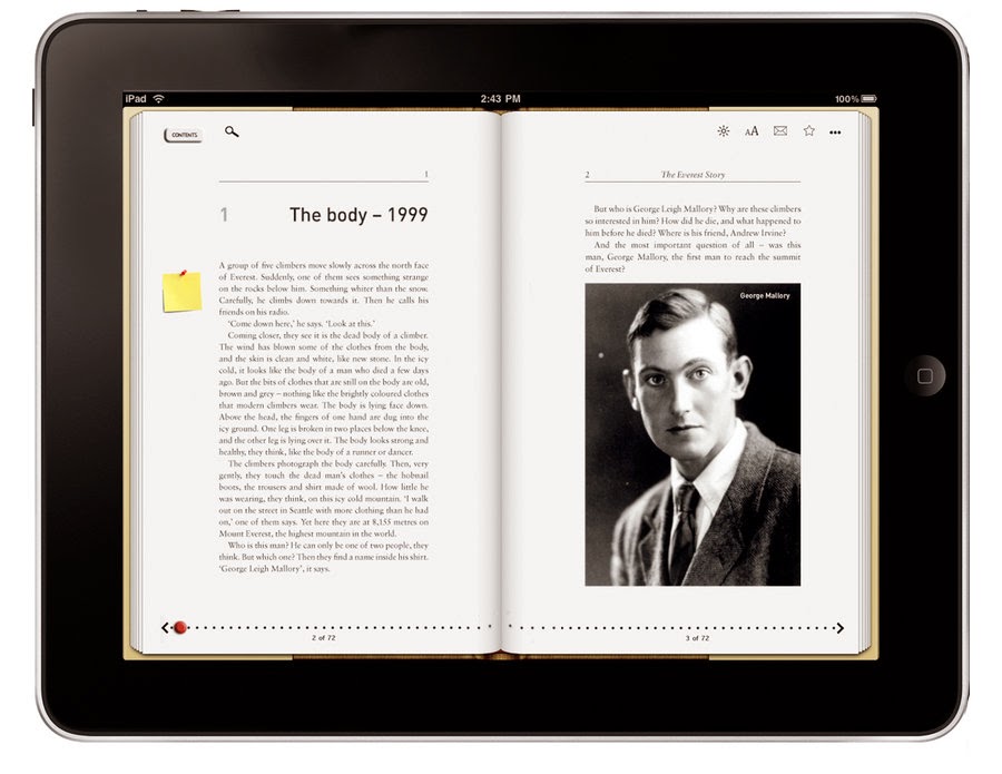
A step beyond this might be to make it a digital book as seen below, drawing in this connection of digital with what was originally a printed source.


 A script layout

Another layout that represents where text may be found, also tying in my uses of scripts in my work and also my interest and influence of film and screen. However a script layout is limited to text only and a limit to what can be presented on a page to keep it a script, so this wouldn't work so well.


Typewriter layout

Mainly because of my uses of a typewriter often in my work, however it is limited to text only and a limited amount of.


Instagram layout

The Instagram layout is taking the social network and digital route, however it has the opposite limits to the above, it has the opportunity for large amounts of images, but is very limited on text and this is a problem as my practice revolves around it.


Twitter layout 

Considering all the choices, a twitter feed would be the best, not only does it center around text and social networking, I am able to add images and an artist profile to it. On the plus side, I can add tweets from relevant artists and create a timeline of my practice.

It would be the best choice to show my practice bringing together a series of ideas and work into one poster, making it easy to read and understand.


16/02/2014

Published Writing | Film | Robocop – Robo reboot falls flat (For Leeds Student News)

My review of Robocop written for Leeds Student News, printed in the 14/02/2014 issue of LSi. The original can be found here.
Image: MGM
The mere mention of Robocop can prompt an awkward shuffle. The long drawn out sighs before some cries “why are they remaking it? Why?!” This was my reaction too, until a recent realisation: we are making reboots harder for ourselves to watch. The industry is going to keep making them anyway, so why not embrace it and see what this new take has to offer. I found the best way to do this is to go in without the mindset of comparing it to the original. Like countless others I hold Robocop close to my heart. It’s a film I saw as a child and loved. He was a badass version of Inspector Gadget.
Set in a near future Detroit, the new adaptation takes on the topical idea of robots and drones being used more in conflicts. OmniCorp are pushing for more robots to be used in law enforcement because it expands their profit margin. In an attempt to win the public’s vote, they introduce Alex Murphy, a cop injured in the line of duty to become the bridge between what it is to be human and mindless killing drone. The film sets up the opportunity to question the contrast between machine and man, corporation marketing and pushy biased media. While it touches on all of these ideas, it never really succeeds in doing so. Instead it struggles in creating any emotionally real characters, let alone Robocop himself. By trying to humanize a robot it ends up dehumanizing its other characters.
Transforming the entire plot into more of a simulation of a computer game, in what may be an attempt to appeal to its younger audience. Robocop now has become something of a generic action movie: it has gun fights, high speed chases and a shouty Samuel L. Jackson. The film really does fall flat.

13/02/2014

Exhibition Consideration | Overheard Conversation Collection | Producing a handout

An important part of my work is this exhibition handout, which has partly become my role in helping to make it working alongside Liam Mayer who has taken a lead role in the running of this exhibition. His role includes laying out the work, the logistics of getting it to and into the space, so he is the one to work with when it comes to producing a small handout containing a map and location of the work.

After discussions we decided this would work best if it was a A3 double sided handout that is then folded down to a A5. Mainly so that we can fit all the information on it without squashing it in and also to be able to hold my work without it falling out.

Another decision was to add a map, a basic line drawn floor plan that would fit on half of a page, each work labelled as a number on it. Which then on the full page of the other side, have the numbers along side the artists name and work name as a reference to find peoples work. Also the aim was to have the title on one A5 segment of the leaflet that would be the side facing up.

We will start laying out the map and where the text will go in InDesign then when we get the information come through we can start adding to it, so it is ready to print.


05/02/2014

Exhibition Consideration | Overheard Conversation Collection | How to present it

In thinking about ways of presenting the idea of the Overheard Conversations I have collected, I need to consider the aims of the piece and what I am trying to achieve. I want to use the overheard sentences, recorded from one environment, documented and preserved rather than being lost with the rest of everyday conversation. Then using them to recreate a similar situation within a different environment, keeping them throwaway, but at the same time engaging to an audience who hopefully will response and interpret the short sentences. Also showing that the same words can have a variety of meanings.

Presentation Ideas

I left the project at the point of the bowl presentation form on a plinth, as the previous A5 typed sheets in a pile on a plinth were too organised that people wouldn't pick it up and interact with them. This meant that the idea didn't work, so the bowl form was created as a way of encouraging people to take from it and read. This did work in that sense, however it was too literal and didn't work to my aims, it was awkward and I think the plinth presentation is to be avoided completely, especially with something like this. Another problem with this work is that the sentences are unedited and some of them weren't right as they were closed sentences and didn't leave much to the audience to interpret. So something new needs to be considered.


During thinking about this I had a discussion in the studio with some others that were around. We discussed this throwaway idea that maybe I could create a tear and take sheet for people to take sentences, this does create a 'i'm here to take' approach, however this encourages people to see and read the sentences before hand, meaning that they make a conscious decision to decide what to take if they choose to take. Also this may work better around the college rather than in an exhibition space.

Same idea as below, but different content.


The next idea went back to how I previously typed the words on A5 sheet, however avoiding a plinth and piling them up. It needed a different set up that would encourage people to find them rather than be in a obvious place that doesn't interest people so much, they simple just see it and walk on.

So came the idea of scattering them around the exhibition space as if they had already been seen and just dropped, I liked this idea, but maybe as an outcome rather than setting out to do so. So I thought about simply handing them out. But this brings me back to the same problem of  them being obviously there. Then I thought about what can be handed out at an exhibition and hiding them in that.

If we produced exhibition handouts containing maps, people will take them as they want to know which is which work. By hiding them in this handout, people will take them without knowing, hiding them in plain sight. Only when they open them will they see the paper, and this starts a cycle of either dropping them as they don't see them and someone else trying to retrieve it or seeing it and wondering what it is. I like this idea, after further discussions, I decided to try this idea out, which means my next steps are to plan and make an exhibition leaflet.

03/02/2014

Exhibition Consideration | Refining my idea | Overheard Conversation Collection

As the exhibition deadline approaches, it got me thinking about some new ideas I have that involves making some books, however I am worried that with just over a month before the exhibition, it would involve working really fast to complete these new ideas that are in their early forms, by doing so they won't be refined and may not work as well as they could.

My other option is to refine past work, and being that I feel the last project isn't fully finished, I think I am best starting from where I finished before. Which means I am stuck at how to present my overheard conversation pieces.

I need to consider how to present this idea, I need to think about using the overheard conversations in the way that people will interact with them, but not being too forceful and literal about the presentation, which the bowl presentation before was.

This will require further thinking and exploration, which I am taking for my exhibition piece. Making a new piece doesn't make sense, I need to take more time to think and consider my work rather than rush through the process, starting at this point.